


“My amazing forecasting method has a lower MASE than any other method!” You’ve probably seen claims like this on social media or in papers. But have you ever thought about what it really means?
Many forecasting experiments come to applying several approaches to a dataset, calculating error measures for each method per time series and aggregating them to get a neat table like this one (based on the M and tourism competitions, with R code similar to the one from this post):
           RMSSE    sCE
ADAM ETS   1.947  0.319
ETS        1.970  0.299
ARIMA      1.986  0.125
CES        1.960 -0.011
Typically, the conclusion drawn from such tables is that the approach with the measure closest to zero performs the best, on average. I’ve done this myself many times because it’s a simple way to present results. So, what’s the issue?
Well, almost any error measure has a skewed distribution because it cannot be lower than zero, and its highest value is infinity (this doesn’t apply to bias). Let me show you:
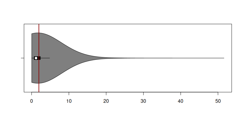
Distribution of RMSSE for ADAM ETS on M and tourism competitions data
This figure shows the distribution of 5,315 RMSSE values for ADAM ETS. As seen from the violin plot, the distribution has a peak close to zero and a very long tail. This suggests that the model performed well on many series but generated inaccurate forecasts for just a few, or perhaps only one of them. The mean RMSSE is 1.947 (vertical red line on the plot). However, this single value alone does not provide full information about the model’s performance. Firstly, it tries to represent the entire distribution with just one number. Secondly, as we know from statistics, the mean is influenced by outliers: if your method performed exceptionally well on 99% of cases but poorly on just 1%, the mean will be higher than in the case of a poorly performing method that did not do that badly on 1%.
So, what should we do?
At the very least, provide both mean and median error measures: the distance between them shows how skewed the distribution is. But an even better approach would be to report mean and several quantiles of error measures (not just median). For instance, we could present the 1st, 2nd (median), and 3rd quartiles together with mean, min and max to offer a clearer understanding of the spread and variability of the error measure:
             min    1Q  median    3Q     max  mean
ADAM ETS   0.024 0.670   1.180 2.340  51.616 1.947
ETS        0.024 0.677   1.181 2.376  51.616 1.970
ARIMA      0.025 0.681   1.179 2.358  51.616 1.986
CES        0.045 0.675   1.171 2.330  51.201 1.960
This table provides better insights: ETS models consistently perform well in terms of mean, min, and first quartile RMSSE, while ARIMA outperformed them in terms of median. CES did better than the others in terms of median, third quartile, and the maximum. This means that there were some time series, where ETS struggled a bit more than CES, but in the majority of cases it performed well.
So, next time you see a table with error measures, keep in mind that the best method on average might not be the best consistently. Having more details helps in understanding the situation better.
You can read more about error measures for forecasting in the “forecast evaluation” category.