


So far, we’ve discussed forecasts evaluation, focusing on the precision of point forecasts. However, there are many other dimensions in the evaluation that can provide useful information about your model’s performance. One of them is bias, which we’ll explore today.
Introduction
But before that, why should we bother with bias? Research suggests that bias is more related to the operational performance than accuracy. For example, Sanders & Graman (2016) discovered that an increase in bias leads to an exponential rise in operational costs, whereas similar deterioration in accuracy results in a linear cost increase. Kourentzes et al., (2020) estimated forecasting models using different loss functions, including the one based on the inventory costs, and found that better inventory performance was associated with lower bias. These findings indicate that high bias impacts supply chain and inventory costs more substantially than low accuracy does. Thus, minimizing bias in your model is crucial.
So, how can we measure it?
When producing a point forecast and comparing it to actual values, you get a collection of forecast errors. Averaging the squares of these errors gives the Mean Squared Error (MSE). If you average their absolute values, you obtain the Mean Absolute Error (MAE). Both measures assess the variability of actual values around your forecast, but in different ways. But we can also measure whether the model systematically overshoots or undershoots the actual values. To do that, we can average the errors without removing their signs, resulting in the Mean Error (ME), which measures forecast bias.
A simple interpretation of the ME, is that it shows whether the forecast consistently overshoots (negative value) or undershoots (the positive one) the actual values. An ME of zero suggests that, on average, the point forecast goes somehow closely to the middle of the data. Here is a visual example of the three situations:
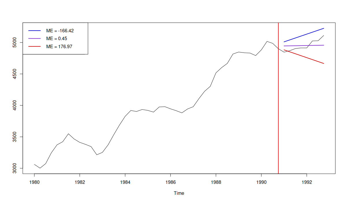
Example of three forecasts with different bias
In the plot above, we have three cases:
- Forecast is negatively biased, overshooting the data with ME = -166.42 (the blue line);
- Forecast is almost unbiased, going in the middle of the data (but not being able to capture the structure correctly) with ME=0.45 (purple line);
- Forecast is positively biased, undershooting the data with ME=176.97 (the red line);
If we were to make a decision only based on the ME, we would need to say that the second forecast (purple line) is unbiased and should be preferred. The problem is that the ME does not measure how well the forecast captures the structure or how close it is to the actual data. This is why bias should not be used on its own, but rather in combination with some accuracy measure (e.g. RMSE). Arguably, a much better forecast is the one shown below:
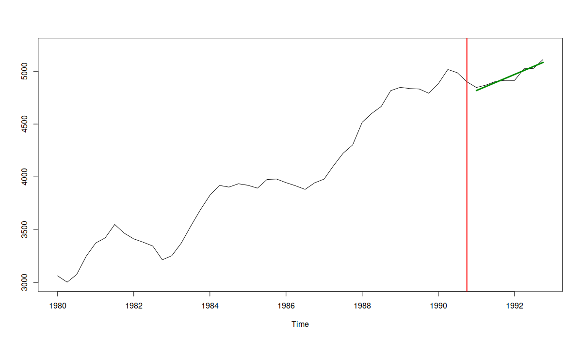
An example of an unbiased and accurate forecast
In this figure, we see that not only the forecast line goes through the data in the holdout, but it also captures accurately an upward trend, achieving an ME of 0.28 and the lowest RMSE among the discussed forecasts.
So, as we see, it is indeed important to track both bias and accuracy. What’s next?
How to aggregate Mean Error
Well, we might need to aggregate the mean error to get an overall impression about the performance of our model across several time series. How do we do that?
If you are thinking of calculating the “Mean Percentage Error” (similarly to MAPE, but without absolute value), then don’t! It will have the same problems caused by the division of the error by the actuals (as discussed here, for example). Instead, it’s better to use a reliable scaling method. At the very least, you could divide the mean error by the in-sample mean to get something called a “scaled Mean Error” (sME). An even better option is to divide the ME by the mean absolute differences of the data to get rid of a potential trend (similar to how it was done in MASE by Koehler & Hyndman 2006).
After that, you will end up with distributions of scaled MEs for various forecasting approaches across different products, like the one shown in the image below (we discussed a similar idea in this post):
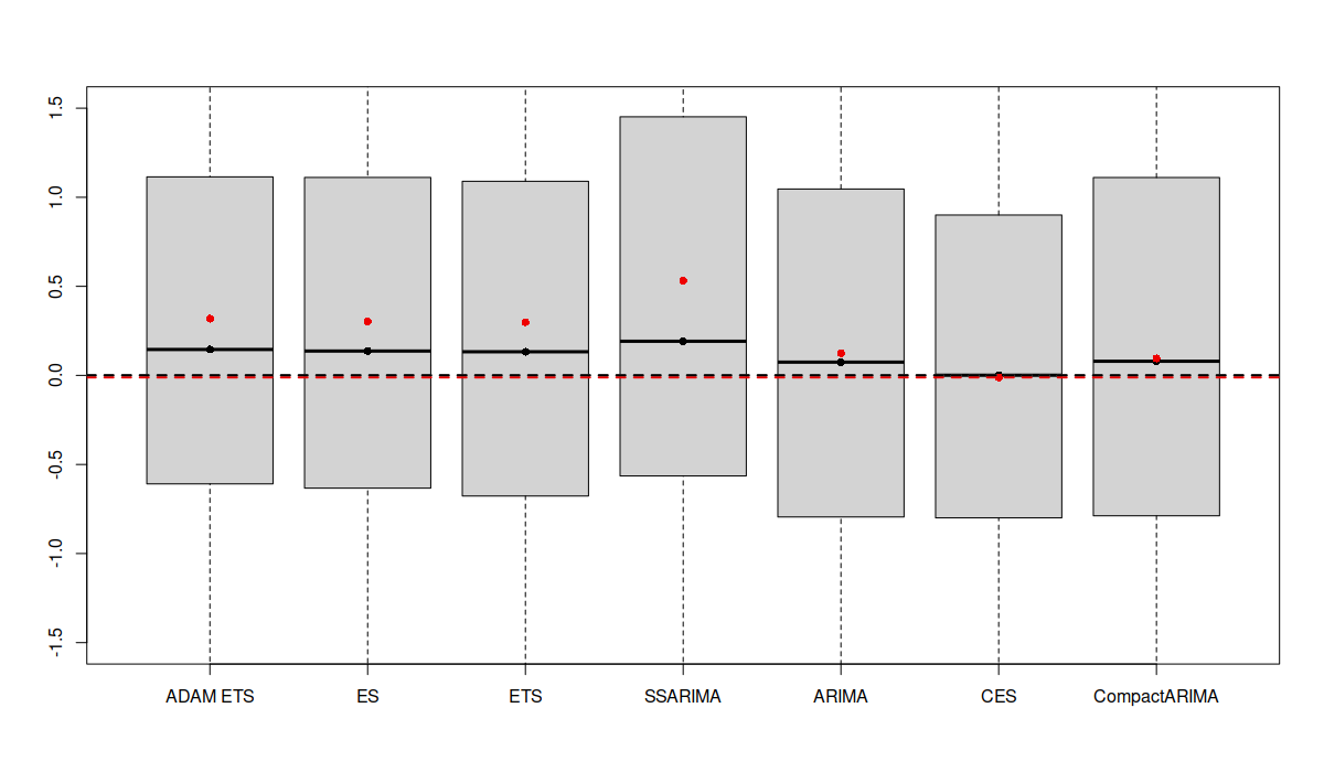
Boxplots of scaled Mean Errors for several forecasting models
The boxplots above are zoomed in because there were some cases with extremely high bias. We can see that different forecasting methods produce varying distributions of sMEs: some are narrower, others wider. Comparing the means (red dots) and medians (black dots) of these distributions, it appears that the CES model is the least biased on average since its mean and median are closest to zero. However, averaging like this can be misleading as positive and negative biases can cancel each other out, resulting in an “average temperature in the hospital” situation. Besides, just because the average of sMEs for one method is closer to zero, it doesn’t necessarily mean it is consistently less biased. This only shows that it is least biased on average. A more useful approach might be to look at the distribution of the absolute values of sMEs (after all, it is not as important whether the model is positively or negatively biased on average, as whether it is biased at all):
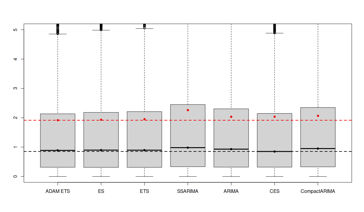
Boxplots of absolute scaled Mean Errors for several forecasting models
In the image above, it becomes clear that CES is the least biased approach in terms of median, while the ETS is the least biased one in terms of mean. This suggests that CES has some instances of higher bias compared to ETS. Additionally, the boxplot for CES is narrower, indicating that in most cases, it produces less biased forecasts.
Bias and accuracy
Finally, as discussed above, it makes sense to look at both bias and accuracy together to better understand how models perform. But how exactly can we do this?
DISCLAIMER: the ideas I am about to share are based on my own understanding of the issue. Most of the research on forecasting focuses on evaluating accuracy, and there are only a few studies on bias. I haven’t come across any studies that address both bias and accuracy together in a holistic way. So, take this with a grain of salt, and I’d appreciate any references to relevant studies that I might have missed.
To jointly analyze both bias and accuracy, we might try to summarize them using mean to gain a clearer picture of how models perform on our data. However, simply looking at their average values can be misleading (see this post). A better approach could be to look at the quartiles and the means of these measures. Since bias often relates more directly to operational costs, it might make sense to examine it first. Here is an example using the same dataset as in this post (the lower the value, the better the model performs in terms of absolute bias):
Absolute Bias
           min    1Q  median    3Q     max  mean
ADAM ETS 0.000 0.277   0.748 1.862  39.694 1.463
ETS      0.001 0.281   0.760 1.901  39.694 1.488
ARIMA    0.000 0.297   0.778 1.875  39.694 1.509
CES      0.000 0.278   0.753 1.801  39.294 1.473
From the table above, we see that no single model consistently outperforms the others across all measures of absolute bias. However, the ADAM ETS model does better than others in terms of the median and mean absolute bias, and it’s the second-best in terms of the third quartile and the maximum value. The second least biased model is CES, which suggests these two models could be prime candidates for the next step in the model selection.
Looking at accuracy, we see the following picture:
Accuracy
           min    1Q  median    3Q     max  mean
ADAM ETS 0.024 0.670   1.180 2.340  51.616 1.947
ETS      0.024 0.677   1.181 2.376  51.616 1.970
ARIMA    0.025 0.681   1.179 2.358  51.616 1.986
CES      0.045 0.675   1.171 2.330  51.201 1.960
The accuracy tells us a slightly different story: CES appears to be the most accurate in terms of the median, third quartile, and maximum values. ETS still performs better in terms of the mean, minimum, and first quartile. Given these mixed results, we can’t conclusively choose the best model between the two. Therefore, our selection might also consider other factors, such as computational time, ease of understanding, or simplicity of the model (ETS, for instance, is arguably simpler than the Complex Exponential Smoothing).