


Look at the image above. Which forecast seems more appropriate: the red straight line (1) or the purple wavy line (2)? Many demand planners might choose option 2, thinking it better captures the ups and downs. But, in many cases, the straight line is just fine. Here’s why.
In a previous post on Structure vs. Noise, we talked about how a time series is made up of different components (such as level, trend, and seasonality), and how the main goal of a point forecast is to capture the structure of the data, not the noise. Noise is unpredictable, and it should be treated by capturing uncertainty around the point forecasts (e.g., prediction intervals).
So the answer to the question in the very beginning of this post comes to understanding what sort of structure we have in the data. In the series attached to the image, the only structure we have is the level (average sales). There’s no obvious trend, no seasonality, no apparent outliers, and we do not have promotional information or any explanatory variables. The best you can do in that situation is capture the level correctly and produce a straight line (parallel to the x-axis) for the next 10 observations.
In this case, we used our judgment to decide what’s appropriate. That works well when you’re dealing with just a few time series. Petropoulos et al. (2018) showed that humans are quite good at selecting models in such a task as above. But what do you do when you have thousands or even millions of time series?
The standard approach today is to apply several models or methods and choose the one that performs best on a holdout sample using an error measure, like RMSE (Root Mean Square Error, for example, see this). In our example, the red line produced a forecast with an RMSE of 10.33, while the purple line had an RMSE of 10.62, suggesting that the red line is more accurate. However, relying only on one evaluation can be misleading because just by chance, we can get a better forecast with a model that overfits the data.
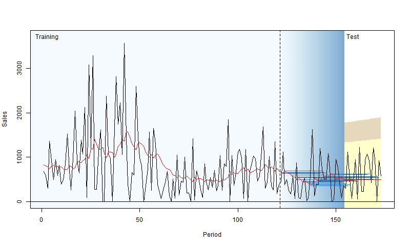
To address this, we can use a technique called “rolling origin evaluation” (Tashman, 2000). The idea is to fit the model to the training data, evaluate its performance on a test set over a specific horizon (e.g., the next 10 days), then add one observation from the test set to the training set and repeat the process. This way, we gather a distribution of RMSEs, leading to a more reliable conclusion about a model’s performance. Nikos Kourentzes has created a neat visualization of this process:
For more details with examples in R, you can check out Section 2.4 of my book.
After doing a rolling origin evaluation, you might find that the straight line is indeed the best option for your data. That’s perfectly fine – sometimes, simplicity is all you need. But then the real question becomes: what will you do with the point forecasts you’ve produced?