Introduction
Some people think that the main idea of forecasting is in predicting the future as accurately as possible. I have bad news for them. The main idea of forecasting is in decreasing the uncertainty.
Think about it: any event that we want to predict has some systematic components \(\mu_t\), which could potentially be captured by our model, and a random error \(\epsilon_t\). The latter might not be purely random in its nature, but this component absorbs all the factors that we cannot predict. For example, it is impossible to predict, whether a specific person will get ill in a specific day and go to a hospital. So, the observed demand (you can bravely substitute this word by whatever you work with) can be roughly represented in the following way:
\begin{equation} \label{eq:demand}
y_t = \mu_t + \epsilon_t,
\end{equation}
where \(y_t\) is the actual value of demand (there is another formula for the multiplicative model, but it does not change the discussion, so we skip it for now in order not to overcomplicate things). And here comes the revelation: what we usually do in forecasting, is capture \(\mu_t\) as correctly as possible, so that we could predict the structure, and infer somehow the uncertainty \(\epsilon_t\) around it. When it comes to \(\epsilon_t\), all that we can usually do is estimate its mean and variance.
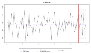
So, when we have a data like this:
we can say that the average level of demand is close to 1000, and that there is a variability around it with some standard deviation \(\sigma \approx 100 \). The trick here is to get correctly \(\mu_t\) and \(\sigma\), so that we can do appropriate predictions. If we do that correctly, then we can produce point forecasts (the blue line on the graph) and a prediction interval of a width \(1-\alpha\) (let’s say 0.95, the grey area on the graph), which in the ideal situation should contain \((1-\alpha) \times 100\)% of observations in it, when we produce forecasts for the holdout sample.
In real life, we never know \(\mu_t\), so, when trying to capture it, we might underestimate it in some cases (e.g. not include seasonality, when it is needed), which would lead to the higher variance of the error term, the increased uncertainty and wider prediction intervals. Alternatively, we might overestimate \(\mu_t\) (e.g. include trend, when it is not needed), which would lead to the lower variance, unrealistically small uncertainty and the narrow intervals. So, when we select the most appropriate model for the data, we want to get as close as possible to the true \(\mu_t\) and \(\sigma\). Note that whenever we need to estimate \(\sigma\), there is a way to make it closer to the “true” one by introducing the correction of the bias:
\begin{equation} \label{eq:biasCorrection}
s = \sqrt{\frac{\sum_{t=1}^T e_t^2}{T-k}},
\end{equation}
where \(e_t\) is the estimated error term, \(T\) is the number of observations in the sample and \(k\) is the number of estimated parameters.
When it comes to the practicalities, we produce point forecasts, which usually correspond to the conditional mean of the model, and the prediction intervals (quantiles of the assumed future distribution), which somehow reflect the uncertainty we capture. There has already been a post on the construction of prediction intervals on this website, and we have discussed how to assess the accuracy of point forecasts. So, the next natural question that we should have, is how to assess the accuracy of prediction intervals. How can we tell whether the model captures the uncertainty well?
Interval measures
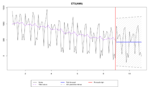
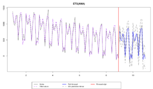
Consider the following example in R, using smooth v2.5.4. We generate the data from ETS(A,N,A) model and then apply three different models:
library(smooth)
x <- sim.es("ANA", obs=120, frequency=12, persistence=c(0.3,0.1), initial=c(1000), mean=0, sd=100)
modelUnderfit <- es(x$data, "ANN", silent=F, interval=T, holdout=T, h=24)
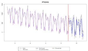
modelOverfit <- es(x$data, "AAA", silent=F, interval=T, holdout=T, h=24)
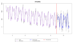
modelCorrect <- es(x$data, "ANA", silent=F, interval=T, holdout=T, h=24)
modelTrue <- es(x, silent=F, interval=T, holdout=T, h=24)
The data exhibits the change of level and some changes of seasonal component over time, and there are four models applied to it:
- ETS(A,N,N), which underfits the data, because it does not have the seasonal component,
- ETS(A,A,A), which overfits the data, because it contains the redundant component (in this example the trend),
- ETS(A,N,A), which is correctly specified, but differs from the true model due to the estimation on a sample.
- ETS(A,N,A) with the true parameters, which is supposed to be ideal in this situation.
All these models produce different point forecasts, which we can asses using some error measures:
errorMeasures <- rbind(modelUnderfit$accuracy,
                       modelOverfit$accuracy,
                       modelCorrect$accuracy,
                       modelTrue$accuracy)[,c("sMAE","sMSE","sCE")]
rownames(errorMeasures) <- c("Model Underfit","Model Overfit","Model Correct","Model True")
errorMeasures*100
                    sMAE      sMSE       sCE
Model Underfit 45.134368 25.510527 -122.3740
Model Overfit  19.797382  5.026588 -449.8459
Model Correct   9.580048  1.327130 -149.7284
Model True      9.529042  1.318951 -139.8342
Note that in our example, the first model is the least accurate, because it does not contain the seasonal component, but it produces the least biased forecasts, probably just by chance. The second model is more accurate than the first one in terms of sMAE and sMSE, because it contains all the necessary components, but it is not as accurate as the correct model, because of the trend component – the forecasts in the holdout continue the declining trajectory, while in reality they should not. The difference in terms of accuracy and bias between the correct and the true models is small, but it seems that in our example, the correct one is a bit worse, which is probably due to the estimation of the smoothing parameters.
More importantly these models produce different prediction intervals, but it is difficult to tell the difference in some of the cases. So, what we could do in order to assess the accuracy of the prediction intervals is to calculate Mean Interval Score (MIS) metrics, proposed by Gneiting (2011) and popularised by the M4 Competition:
\begin{equation} \label{MIS}
\begin{matrix}
\text{MIS} = & \frac{1}{h} \sum_{j=1}^h \left( (u_{t+j} -l_{t+j}) + \frac{2}{\alpha} (l_{t+j} -y_{t+j}) \mathbb{1}(y_{t+j} < l_{t+j}) \right. \\ & \left. + \frac{2}{\alpha} (y_{t+j} -u_{t+j}) \mathbb{1}(y_{t+j} > u_{t+j}) \right) ,
\end{matrix}
\end{equation}
where \(u_{t+j}\) is the upper bound, \(l_{t+j}\) is the lower bound of the prediction interval, \(\alpha\) is the significance level and \(\mathbb{1}(\cdot)\) is the indicator function, returning one, when the condition is true and zero otherwise. The idea of this measure is to assess the range of the prediction intervals together with the coverage. If the actual values lie outside of the interval they get penalised with a ratio of \(\frac{2}{\alpha}\), proportional to the distance from the interval. At the same time the width of the interval positively influences the value of the measure. The idealistic model with the MIS=0 should have all the values in the holdout lying on the bounds of the interval and \(u_{t+j}=l_{t+j}\), which means that there is no uncertainty about the future, we know what’s going to happen with the 100% precision (which is not possible in the real life).
This measure is available in greybox package for R:
c(MIS(modelUnderfit$holdout,modelUnderfit$lower,modelUnderfit$upper,level=0.95),
  MIS(modelOverfit$holdout,modelOverfit$lower,modelOverfit$upper,level=0.95),
  MIS(modelCorrect$holdout,modelCorrect$lower,modelCorrect$upper,level=0.95),
  MIS(modelTrue$holdout,modelTrue$lower,modelTrue$upper,level=0.95))
[1] 1541.6667 1427.7527 431.7717 504.8203
These number do not say anything on their own, they should be compared between the models. The comparison shows that the first two models do not perform well, while the correct model seems to be doing the best job, even better than the true one (this could have happened by chance).
Unfortunately, this is a one-number measure, so we cannot say what specifically happened in our case. We can infer based on the graphs, that the first model had the widest range, and the second one had too many values lying outside the interval, but we cannot say that by simply looking at MIS values. In order to investigate this, we can check the average range of these intervals, so that we get an idea, whether the uncertainty has been captured correctly by the models:
\begin{equation} \label{range}
\text{range} = \frac{1}{h} \sum_{j=1}^h (u_{t+j} -l_{t+j}) ,
\end{equation}
which in human language means to average out the width of the interval from one step ahead to h steps ahead. This can be easily calculated in R:
c(mean(modelUnderfit$upper - modelUnderfit$lower),
  mean(modelOverfit$upper - modelOverfit$lower),
  mean(modelCorrect$upper - modelCorrect$lower),
  mean(modelTrue$upper - modelTrue$lower))
[1] 1541.6667 297.1488 431.7717 504.8203
Looking at these numbers, it appears that the second model (overfitting the data) has the narrowest prediction interval of the four models. It seems to underestimate the uncertainty substantially, which leads to the problem of not covering the necessary 95% of observations in the holdout. The first model, as we noted above, has the unreasonably wide prediction interval, and the last two models are producing the more or less balanced intervals.
Another thing that we can check with the intervals is the coverage (how many observations are in the prediction interval in the holdout):
\begin{equation} \label{coverage}
\text{coverage} = \frac{1}{h} \sum_{j=1}^h \left( \mathbb{1}(y_{t+j} > l_{t+j}) \times \mathbb{1}(y_{t+j} < u_{t+j}) \right) ,
\end{equation}
which can be done in R using the following command:
c(sum((modelUnderfit$holdout > modelUnderfit$lower & modelUnderfit$holdout < modelUnderfit$upper)) / length(modelUnderfit$holdout),
  sum((modelOverfit$holdout > modelOverfit$lower & modelOverfit$holdout < modelOverfit$upper)) / length(modelOverfit$holdout),
  sum((modelCorrect$holdout > modelCorrect$lower & modelCorrect$holdout < modelCorrect$upper)) / length(modelCorrect$holdout),
  sum((modelTrue$holdout > modelTrue$lower & modelTrue$holdout < modelTrue$upper)) / length(modelTrue$holdout))
[1] 1.0000000 0.5416667 1.0000000 1.0000000
Unfortunately, this is not very helpful, when only one time series is under consideration. For example, in our case the first, the third and the fourth models cover all the 100% observations in the holdout, and the second one covers only 54.2%. None of this is good, but we cannot say much anyway, because this is just one time series with 24 observations in the holdout.
By looking at the range and coverage, we can now understand, why the MIS had those values that we have observed earlier: models 1, 3 and 4 cover everything, while the model 2 does not, but has the narrowest interval.
If we want to further investigate the performance of models in terms of prediction intervals, we can calculate the pinball loss function, for each of the bounds separately (which seems to originate from the work of Koenker & Basset, 1978):
\begin{equation} \label{pinball}
\text{pinball} = (1 -\alpha) \sum_{y_{t+j} < b_{t+j}, j=1,\dots,h } |y_{t+j} -b_{t+j}| + \alpha \sum_{y_{t+j} \geq b_{t+j} , j=1,\dots,h } |y_{t+j} -b_{t+j}|,
\end{equation}
where \(b_{t+j}\) is the value of a bound (either an upper, or a lower). What pinball is supposed to show is how well we capture the specific quantile in the data. The lower the value of pinball is, the closer the bound is to the specific quantile of the holdout distribution. If the pinball is equal to zero, then we have done the perfect job in hitting that specific quantile.
In our example, we used 95% prediction interval, which means that we have produced the 2.5% and 97.5% quantiles, corresponding to the lower and the upper bounds. We can calculate the pinball loss using the respective function from greybox package:
pinballValues <- cbind(c(pinball(modelUnderfit$holdout,modelUnderfit$lower,0.025),
                         pinball(modelOverfit$holdout,modelOverfit$lower,0.025),
                         pinball(modelCorrect$holdout,modelCorrect$lower,0.025),
                         pinball(modelTrue$holdout,modelTrue$lower,0.025)),
                       c(pinball(modelUnderfit$holdout,modelUnderfit$upper,0.975),
                         pinball(modelOverfit$holdout,modelOverfit$upper,0.975),
                         pinball(modelCorrect$holdout,modelCorrect$upper,0.975),
                         pinball(modelTrue$holdout,modelTrue$upper,0.975)))
rownames(pinballValues) <- c("Model Underfit","Model Overfit","Model Correct","Model True")
colnames(pinballValues) <- c("lower","upper")
pinballValues
                  lower    upper
Model Underfit 484.0630 440.9371
Model Overfit  168.4098 688.2418
Model Correct  155.9144 103.1486
Model True     176.0856 126.8066
Once again, the pinball values do not tell anything on their own, and should be compared with each other. By analysing this result, we can say that the correct model did the best job in terms of capturing the quantiles correctly. It even did better than the true model, which agrees with what we have observed in the analysis of MIS, coverage and range. Note that the true model outperformed the correct one in terms of the accuracy (sMAE, sMSE, sCE), but it did not do that in terms of capturing the uncertainty. Still, this is only one time series, so we cannot make any serious conclusions based on it...
Also, the first model has the highest pinball value for the lower bound and the second highest for the upper one. This is because the intervals are too wide.
Furthermore, the second model has an adequate lower pinball, but has a too high upper one. This is because the model contains the trend component and predicts a decline.
As a side note, it is worth saying that the quantiles are very difficult to assess correctly using the pinball function on small samples. For example, in order to get a better idea of how the 97.5% bound performs, we would need to have at least 40 observations, so that 39 of them would be expected to lie below this bound (\(\frac{39}{40} = 0.975\)). In fact, the quantiles are not always uniquely defined, which makes the measurement difficult. Just as a reminder for those of you who are comfortable with mathematics, the \(\alpha\)-quantile is defined as:
\begin{equation} \label{quantile}
P \left(y_t < q_{\alpha} \right) = \alpha ,
\end{equation}
which reads as "the probability that a value will be lower than the specified \(\alpha\)-quantile is equal to \(\alpha\)". So, we are saying, for example, that \(q_{97.5\%}\) is such a number that guarantees that 97.5% of observations in the holdout would lie below it. And in order to assess the performance of interval more precisely, we need to measure it on a bigger sample, it might not work well on an example of fixed origin and just one time series.
Finally, MIS, range and pinballs are measured in the units of the original data (e.g. pints of beer). So, they cannot be summarised, when we deal with different time series and want to aggregate them across. In order to do that correctly, we would need to get rid of units somehow. We can use scaling (divide the value by the mean of series as Petropoulos & Kourentzes (2015) or a mean differences of the data as Hyndman & Koehler (2006) and M4 competition) or calculate relative values, using one of them as a benchmark (similar to Davydenko & Fildes (2013)).
An experiment in R
In order to see the performance of the discussed measures on a bigger sample, we conduct a simple simulation experiment in R, using the same setting but for the dataset of 1000 time series. The whole script for the experiment is shown below:
This code can be more efficient if the calculations are done in parallel rather than in serial, but this should suffice for an example.
The problem that we have now is that MIS, range and pinball are measured in the units of the original data and cannot be aggregated as is. A simple solution would be to take one of the models as a benchmark and calculate the relative measures. Let’s use the correct model as a benchmark (note that we do not do anything with the coverage as it is already unitless):
errorMeasuresRelative <- errorMeasures
for(i in 1:4){
    errorMeasuresRelative[,i,c(1,2,4,5)] <- errorMeasures[,i,c(1,2,4,5)] / errorMeasures[,3,c(1,2,4,5)]
}
This way we obtain relative range, relative MIS and relative pinball values, which can now be analysed however we want, for example, using geometric means:
round(cbind(exp(apply(log(errorMeasuresRelative[,,-3]),c(2,3),mean)),
            apply(errorMeasuresRelative,c(2,3),mean)[,3,drop=FALSE]),3)
                 MIS Range Lower Upper Coverage
Model Underfit 2.091 2.251 2.122 2.133    0.958
Model Overfit  1.133 1.040 1.123 1.113    0.910
Model Correct  1.000 1.000 1.000 1.000    0.938
Model True     0.962 1.013 0.964 0.963    0.951
As we can see from this example, the model that underfits the data has the 125.1% wider range than the correct on, and it also has the higher upper and lower pinball values (112.2% and 113.3% higher respectively). So, it overestimates the uncertainty, because it does not have the correct time series component. However, it has the coverage closest to the nominal among the first three models, which is difficult to explain.
The second model, which overfits the data, has higher range than the correct one and includes less observations in the holdout. So due to the redundant components, it underestimates the uncertainty.
We also have the true model, which does not have an issue with the estimation and thus covers the nominal 95% of the observations in the holdout, producing slightly narrower intervals than the ones of the correct model.
Finally, the third model, which is supposed to be correct, does a better job than the first two in terms of the range, MIS and pinball values, but it only contains 93.8% of values in the interval of the 95% width. This is because of the estimation in sample and due to the formulation of the ETS model – the conventional approach of Hyndman et al. (2008) does not take the uncertainty of the parameters into account. This is one of the issues with the ETS in its current state, which has not yet been addressed in the academic literature.
There can be other different reasons, why the prediction intervals do not perform as expected, some of which have been discussed in a post about the intervals in smooth package. The main message from this post is that capturing the uncertainty is a difficult task, and there is still a lot of things that can be done in terms of model formulation and estimation. But at least, when applying models on real data, we can have an idea about their performance in terms of the uncertainty captured.
P.S. I would like to use this opportunity to promote courses run by the Centre for Marketing Analytics and Forecasting. We will have ``Forecasting with R'' course on 30th and 31st January, 2020, which will be taught by Nikos Kourentzes and I in London. If you want to know more, here is the landing page of the course with some information.


