2.5 Statistical comparison of forecasts
After applying several competing models to the data and obtaining a distribution of forecast errors, we might find that some approaches performed very similarly. In this case, there might be a question, whether the difference between them is significant and which of the forecasting models we should select. If they produce similar forecasts then it might make sense to select the one that is less computationally expensive or easier to work with.
Consider the following artificial example, where we have four competing models and measure their performance in terms of RMSSE:
smallCompetition <- matrix(NA, 100, 4,
                           dimnames=list(NULL,
                                         paste0("Method",c(1:4))))
smallCompetition[,1] <- rnorm(100,1,0.35)
smallCompetition[,2] <- rnorm(100,1.2,0.2)
smallCompetition[,3] <- runif(100,0.5,1.5)
smallCompetition[,4] <- rlnorm(100,0,0.3)
We can check the mean and median error measures in this example in order to see, how the methods perform overall:
overalResults <-
  matrix(c(colMeans(smallCompetition),
           apply(smallCompetition, 2, median)),
         4, 2, dimnames=list(colnames(smallCompetition),
                             c("Mean","Median")))
round(overalResults,5)
## Mean Median
## Method1 1.04148 0.97523
## Method2 1.23750 1.23572
## Method3 1.00213 1.02843
## Method4 0.97789 0.92591In this artificial example, it looks like the most accurate method in terms of mean and median RMSSE is Method 4, and the least accurate one is Method 2. However, the difference in terms of accuracy between Methods 1, 3, and 4 does not look substantial. So, should we conclude that Method 4 is the best? Let’s first look at the distribution of errors using vioplot() function from vioplot package (Figure 2.11).
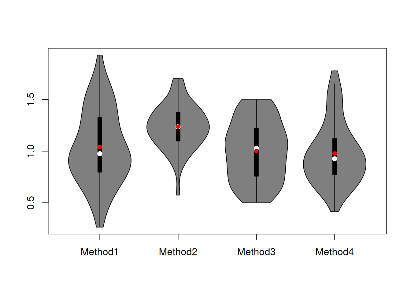
Figure 2.11: Boxplot of RMSE for the artificial example.
The violin plots in Figure 2.11 show that the distribution of errors for Method 2 is shifted higher than the distributions of other methods. It also looks like Method 2 is working more consistently, meaning that the variability of the errors is lower (the size of the box on the graph). It is difficult to tell whether Method 1 is better than Methods 3 and 4 or not – their boxes intersect and roughly look similar, with Method 4 having a slightly shorter box and Method 3 having the box positioned slightly lower.
This is all the basics of descriptive statistics, which allows concluding that in general, Methods 1, 3 and 4 do a better job than Method 2. This is also reflected in the mean and median error measures discussed above. So, what should we conclude?
Well, we should not make hasty decisions, and we should remember that we are dealing with a sample of data (100 time series), so inevitably, the performance of methods will change if we try them on different data sets. If we had a population of all the time series in the world, we could run our methods and make a more solid conclusion about their performances. But here, we deal with a sample. So it might make sense to see whether the difference in performance of the methods is significant. How can we do that?
We can compare means of distributions of errors using a parametric statistical test. We can try the F-test (see, for example Section 10.4 of Newbold et al., 2020), which will tell us whether the mean performance of methods is similar or not. Unfortunately, this will not tell us how the methods compare. But the t-test (see Chapter 10 of Newbold et al., 2020) could be used to do that instead for pairwise comparison. One could also use a regression model with dummy variables for methods, giving us parameters and their confidence intervals (based on t-statistics), telling us how the means of methods compare. However, F-test, t-test, and t-statistics from regression rely on strong assumptions related to the distribution of the means of error measures (that it is symmetric, so that the Central Limit Theorem (CLT) works, see discussion in Section 6.2 of Svetunkov and Yusupova, 2025). If we had a large sample (e.g. a thousand series) and well-behaved distribution, we could try it, hoping that the CLT would work and might get something relatively meaningful. However, on 100 observations, this still could be an issue, especially given that the distribution of error measures is typically asymmetric (the estimate of the mean might be biased, which leads to many issues).
Alternatively, we can compare medians of distributions of errors. They are robust to outliers, so their estimates should not be too biased in case of skewed distributions on smaller samples. To have a general understanding of performance (is everything the same or is there at least one method that performs differently), we could try the Friedman test (Friedman, 1937), which could be considered a nonparametric alternative of the F-test. This should work in our case but will not tell us how specifically the methods compare. We could try the Wilcoxon signed-ranks test (Wilcoxon, 1945), which could be considered a nonparametric counterpart of the t-test, although it tests the so-called “statistical dominance” of one variable versus the other (i.e. not comparing medians, see Chapter 8 of Svetunkov and Yusupova, 2025). But the main issues with it is that it only applies to two variables, while we want to compare four.
Luckily, there is the Nemenyi/MCB test (Demšar, 2006; Koning et al., 2005; Kourentzes, 2012). What the test does, is it ranks the performance of methods for each time series and then takes the mean of those ranks and produces confidence bounds for those means. The means of ranks will capture the overal statistical dominance of one approach above the others. If the confidence bounds for different methods intersect, we can conclude that the performance of methods is not different from a statistical point of view (on the selected significance level). Otherwise, we can see which of the methods has a higher rank and which has the lower one. There are different ways to present the test results, and there are several R functions that implement it, including nemenyi() from the tsutils package. However, we will use the function rmcb() from the greybox, which has more flexible plotting capabilities, supporting all the default parameters for the plot() method.
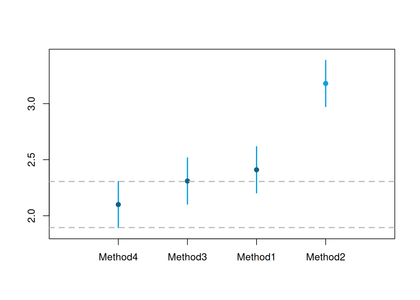
Figure 2.12: MCB test results for small competition.
Figure 2.12 shows that Methods 1, 3, and 4 are not statistically different on the 5% level – their intervals intersect, so we cannot tell the difference between them, even though the mean rank of Method 4 is lower than for the other methods. Method 2, on the other hand, is significantly worse than the other methods on the 5% level: it has the highest mean rank of all, and its interval does not intersect with the intervals of other methods.
Note that while this is a good way of presenting the results, all the MCB test does is a comparison of mean ranks. It does not tell much about the distribution of errors and neglects the distances between values (i.e. 0.1 is lower than 0.11, so the first method has a lower rank, which is precisely the same result as with comparing 0.1 and 100). This happens because by doing the test, we move from a numerical scale to the ordinal one (see Section 1.2 of Svetunkov and Yusupova, 2025). Finally, like any other statistical test, it will become more powerful when the sample increases. We know that the null hypothesis “variables are equal to each other” in reality is always wrong (see Section 7.1 of Svetunkov and Yusupova, 2025), so the increase of sample size will lead at some point to the correct conclusion: methods are statistically different. Here is a demonstration of this assertion:
largeCompetition <-
  matrix(NA, 100000, 4,
         dimnames=list(NULL, paste0("Method",c(1:4))))
# Generate data
largeCompetition[,1] <- rnorm(100000,1,0.35)
largeCompetition[,2] <- rnorm(100000,1.2,0.2)
largeCompetition[,3] <- runif(100000,0.5,1.5)
largeCompetition[,4] <- rlnorm(100000,0,0.3)
# Run the test
rmcb(largeCompetition, outplot="none") |>
    plot(outplot="mcb", main="")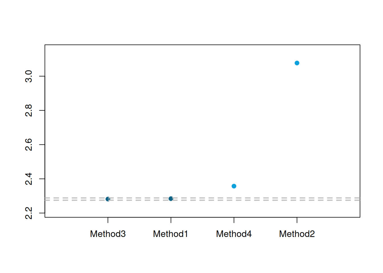
Figure 2.13: MCB test results for the large competition.
In the plot in Figure 2.13, Method 4 has become significantly worse than Methods 1 and 3 in terms of the mean ranks on the 5% level (note that it was winning in the small competition). The difference between Methods 1 and 3 is still not significant at 5%, but it would become so if we continued increasing the sample size. This example tells us that we need to be careful when selecting the best method, as this might change under different circumstances. At least we knew from the start that Method 2 was not suitable.