Chapter 10 Simple Linear Regression
Example 10.1 A timber harvesting company “Timber Lend” needs to measure the volume of trees they cut. While they could measure the volume using physics principles, this is time consuming and they want to speed up the process. They have collected data of 31 trees, which includes:
volumemeasured manually by a special group of tree surgeon,heightof the tree, measured from the bottom to the top of the cut trunk,diameterof the trunk, measured at the bottom.
They want to improve their timber harvesting process by speeding up the volume measurement. How can they do that based on the available data?
The data in this example is available online from here and can be loaded in R the following way:
To answer the question of the company “Timber Lend”, we need to understand how we can capture relations between different variables numerically, so that we would be able to say what volume the company can expect based on the height and/or diameter of each trunk. Yes, we already know how to do graphical and correlations analysis. But this will not provide us sufficient information to answer the question in the beginning of this chapter. Still, the first thing to do is to plot the relation between the variables. We start with analysing the relation between height and volume, which is plotted in Figure 10.1.
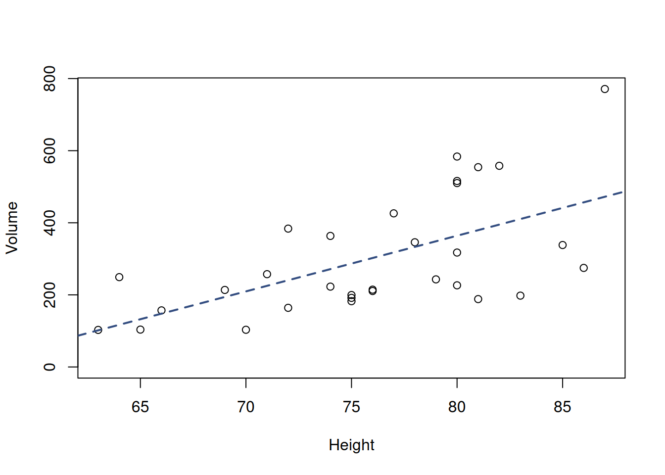
Figure 10.1: Scatterplot matrix of the trees volume and height.
We can see that there is a relation between the height and volume (Figure 10.1), which is mildly linear: with the increase of the height, volume of trees tends to increase on average. In addition to that, we can spot that there is a higher variability in the volume of trees with larger height in comparison with the ones with the lower one. This effect is called “heteroscedasticity” and we will come back to it in Section 15. But the important question for us now is whether we can quantify this relation between the variables, so that we could say, for example, that a tree that has a height of 75 is expected to have some specific volume?
To answer this question, we need to mathematically describe this relation. This can be done by finding coefficients of the line going through the cloud of points in Figure 10.1. The general mathematical form of this line (called “regression line”) is: \[\begin{equation} \hat{y}_j = \beta_0 + \beta_1 x_j, \tag{10.1} \end{equation}\] where \(\hat{y}_j\) is the expected value of the response variable (expected volume in the example above), \(\beta_0\) is the intercept (constant term), showing where the line intersects the y-ays, and \(\beta_1\) is the coefficient for the slope parameter, which regulates how fast the expected volume increases with the increase of height. If \(\beta_1\) is negative, the line would go down, showing that with the increase of one variable, the other tends to decrease. \(\beta_1\) is also the tangent of the angle \(\phi\) between the line drawn through the cloud of points and the x-ays. The two parameters are visualised in Figure 10.2 for an example of some artificial data.
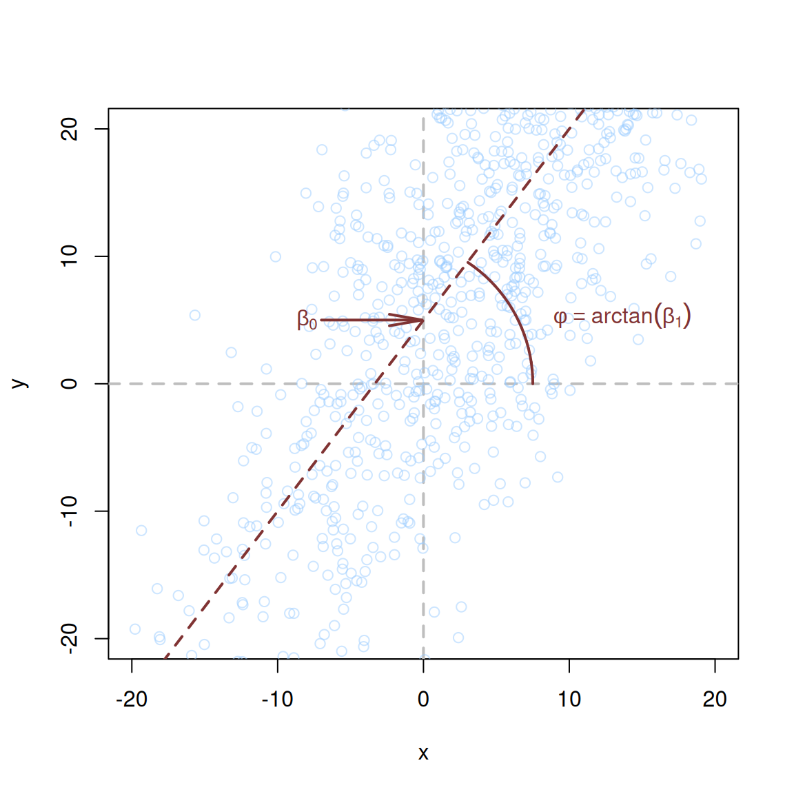
Figure 10.2: Visualisation of regression line drawn for some artificial data.
Based on this regression line, we could explain every observation in sample as: \[\begin{equation} {y}_j = \hat{y}_j + \epsilon_j = \beta_0 + \beta_1 x_j + \epsilon_j, \tag{10.2} \end{equation}\] where \(\epsilon_j\) is the deviation of each specific point from the line. This variable is also called the “error term” and can be shown visually as in Figure 10.3, where each error corresponds to the size of each vertical line. In that figure, we only showed three errors for observations 17, 18 and 31, which all have large heights of 85, 86 and 87 respectively. But we could calculate such errors for all the other points in Figure 10.3.
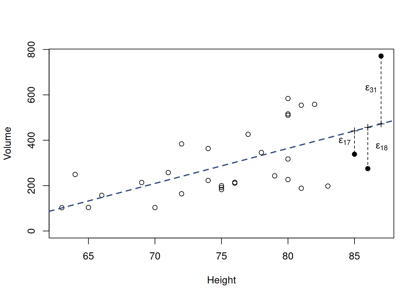
Figure 10.3: Scatterplot diagram between height and volume, together with an error term
The mathematical formula (10.2) is called “simple regression model”, and is one of the basic statistical model (discussed in Subsection 1.1.1) that captures the relation between an explanatory variable \(x_j\) and the response variable \(y_j\) and explains what composes the response variable. In our example, the volume is impacted by the height and some individual errors that happen due to randomness.
Remark. The line in Figure 10.3 captures the averaged-our relation between the height and the volume. We might find some specific points, where the increase of height would not increase volume (e.g. switch from the observation 17 to 18 at the right-hand side of the image), but this can be considered as a random fluctuation. But overall, the average tendency is described by the increasing line.
Now the question is how to capture and quantify this relation correctly, so that we could help the “Timber Lend” company with its problem. One of the simplest techniques for this is called “Ordinary Least Squares”.